Flutter Full Screen Dialog: A Complete Guide to Implementation
in Flutter on August 29, 2024by Kawser MiahDiscover the exciting world of Flutter Full Screen Dialog, Google’s innovative UI toolkit that has transformed the landscape of cross-platform app development. Among its many features, managing dialogs stands out as a key element in enhancing user interaction. In Flutter, dialogs are vital communication tools, enabling apps to convey information, confirm user actions, or collect input without requiring users to leave their current screen.
This guide will take you on an in-depth journey into one of Flutter’s most powerful dialog features: Flutter Full Screen dialogs. These dialogs are particularly useful for showcasing extensive content or engaging users in intricate interactions while preserving the context of their current screen. We will explore the implementation of Flutter Full Screen dialogs, discussing best practices, customization options, and common pitfalls to watch out for.
Table of Contents
Flutter Full Screen Dialog
Understanding Dialogs in Flutter
What Are Dialogs?
In Flutter, dialogs are special routes that overlay the main content, temporarily capturing the user’s attention to display information or request an action. These modal windows require user interaction to be dismissed, thereby making them an essential element for creating interactive and responsive applications.
Types of Dialogs in Flutter
Flutter provides several dialog widgets to cater to different needs:
- Alert Dialog: Ideal for displaying important information that requires acknowledgment, with optional actions for user response.
- Simple Dialog: Presents a list of choices, allowing users to select from multiple options.
- Custom Dialog: Offers complete flexibility to design and structure dialogs according to your specific needs using the Dialog widget.
The Dialog Widget
The Dialog widget forms the basis of all dialog types in Flutter. It provides a blank canvas for developers to build custom dialogs with components like titles, content, and action buttons.
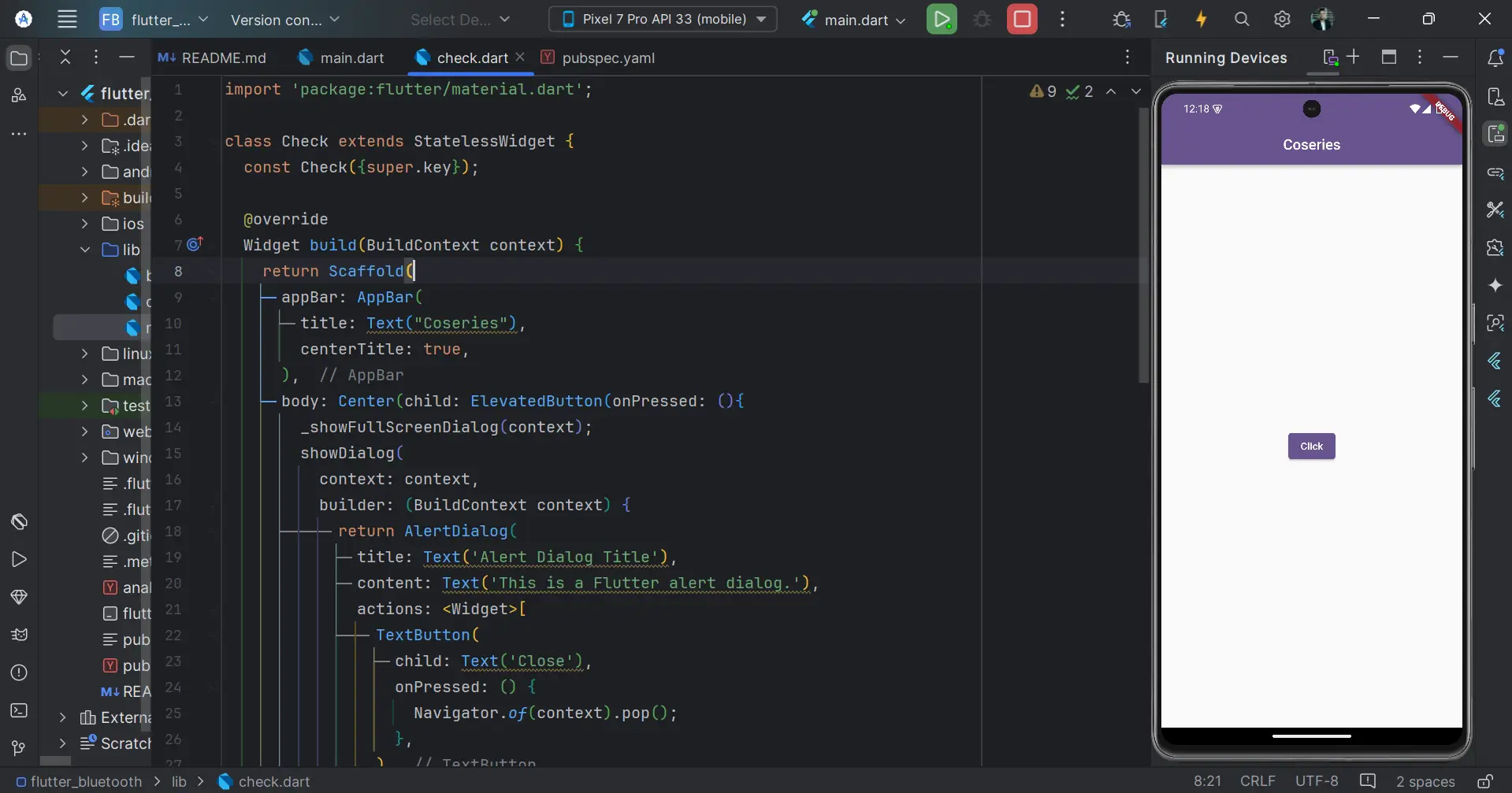
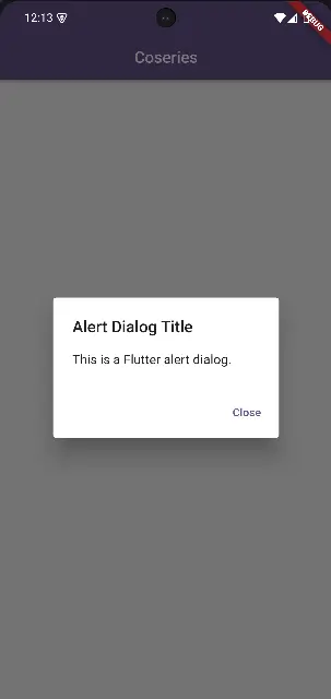
Here’s a basic example of an alert dialog in Flutter:
showDialog(
   context: context,
   builder: (BuildContext context) {
   return AlertDialog(
     title: Text('Alert Dialog Title'),
     content: Text('This is a Flutter alert dialog.'),
     actions: <Widget>[
       TextButton(
         child: Text('Close'),
         onPressed: () {
           Navigator.of(context).pop();
         },
       ),
     ],
   );
 },
);
In this code snippet, showDialog is used to present the dialog, with the context parameter helping to locate the dialog within the widget tree.
OutPut:
Introducing Full Screen Dialogs in Flutter
Flutter Full Screen dialogs are a versatile feature in Flutter, allowing developers to create immersive experiences for tasks that demand the user’s full attention. Unlike standard dialogs, Flutter Full Screen dialogs occupy the entire screen, making them ideal for scenarios where screen real estate is crucial, such as detailed forms or complex workflows.
What Is a Flutter Full Screen Dialog?
A Flutter Full Screen dialog is a dialog that takes over the entire screen, effectively hiding the underlying content. This type of dialog is commonly used for tasks that require more space or focus, like multi-step forms, detailed content displays, or intricate user interactions.
Full Screen Dialogs vs. Regular Dialogs
- Screen Usage: Flutter Full Screen dialogs utilize the entire screen, whereas regular dialogs cover only a portion.
- User Focus: Flutter Full Screen dialogs are designed to capture the user’s complete attention, eliminating distractions.
- Task Complexity: Flutter Full Screen dialogs are ideal for complex tasks that require extensive user interaction or input.
How to Implement a Full Screen Dialog in Flutter
Creating a Flutter Full Screen dialog is straightforward yet powerful. This section will guide you through the process with a step-by-step approach.
Step-by-Step Guide to Creating a Full Screen Dialog
- Define the Route: Use the Navigator.push method to navigate to the Flutter Full Screen dialog.
- Use MaterialPageRoute: Set fullscreenDialog to true within MaterialPageRoute to make the dialog occupy the entire screen.
- Design the Dialog UI: Utilize the Scaffold widget to structure the dialog, complete with an AppBar for navigation and a Body for content.
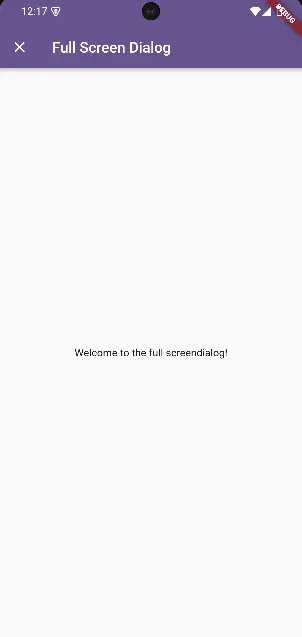
Here’s an example code snippet:
void _showFullScreenDialog(BuildContext context) {
    Navigator.of(context).push(MaterialPageRoute<void>(
      fullscreenDialog: true,
      builder: (BuildContext context) {
        return Scaffold(
          appBar: AppBar(
            title: Text('Full Screen Dialog'),
            leading: IconButton(
              icon: Icon(Icons.close),
              onPressed: () => Navigator.of(context).pop(),
            ),
          ),
          body: Center(
            child: Text('Welcome to the full screendialog!'),
          ),
        );
      },
    ));
  }
This function creates a full screen dialog with a simple layout, providing a clear and focused user experience.
Output:
Customizing Your Full Screen Dialog
Customization is key to integrating Flutter Full Screen dialogs seamlessly into your app. Here are a few ways to tailor your dialogs:
- AppBar Customization: Modify the AppBar to align with your app’s theme by adjusting colors, adding actions, or altering the title.
- Complex Layouts: The Body of the dialog can contain any widget, allowing for intricate layouts, such as forms or lists.
- Custom Animations: While MaterialPageRoute offers a default transition, you can implement custom animations to enhance the user experience.
Best Practices for Using Flutter Full Screen Dialog
Following best practices when implementing dialogs ensures a smooth and user-friendly experience:
- Use Dialogs Judiciously: Avoid overwhelming users by using dialogs only when necessary.
- Prioritize Accessibility: Ensure dialogs are accessible to all users, including those relying on screen readers.
- Maintain Simplicity: Keep the content and actions within dialogs clear and straightforward.
- Integrate Naturally: Design dialogs to fit naturally into the user’s workflow, minimizing disruption.
- Provide Clear Exit Options: Always include an intuitive way to dismiss the dialog, such as a close button or gesture.
- Test Across Devices: Ensure your dialogs look and function correctly on various screen sizes and orientations.
- Choose the Right Dialog Type: Match the dialog type to the task’s complexity, using Flutter Full Screen dialogs for more involved interactions.
Navigating Common Challenges in Flutter Full Screen Dialogs
Awareness of common pitfalls can help you avoid issues that degrade user experience:
- Overuse of Dialogs: Excessive dialog use can frustrate users. Reserve them for critical interactions.
- Ignoring Accessibility: Ensure your dialogs are navigable and usable by everyone.
- Lack of Testing: Test dialogs on multiple devices to avoid layout issues.
- Blocking User Progress: Design dialogs to assist rather than obstruct user workflow.
- Inconsistent Design: Ensure dialogs match your app’s overall design language.
- Overloading Content: Keep dialogs focused and avoid cluttering them with too much information.
- Unclear Exit Options: Make sure users can easily dismiss dialogs without confusion.
Conclusion: Enhancing Your Flutter Apps with Full Screen Dialogs
Flutter Full Screen dialogs are a powerful tool in Flutter that can significantly enhance user engagement by providing a dedicated space for complex interactions. By following the guidelines and best practices outlined in this guide, you can effectively implement Flutter Full Screen dialogs that are both functional and user-friendly. As you continue to build and refine your Flutter applications, Flutter Full Screen dialogs will help you create more immersive and focused user experiences.
You can read also: Enhance Your App’s Functionality with Speech to Text

