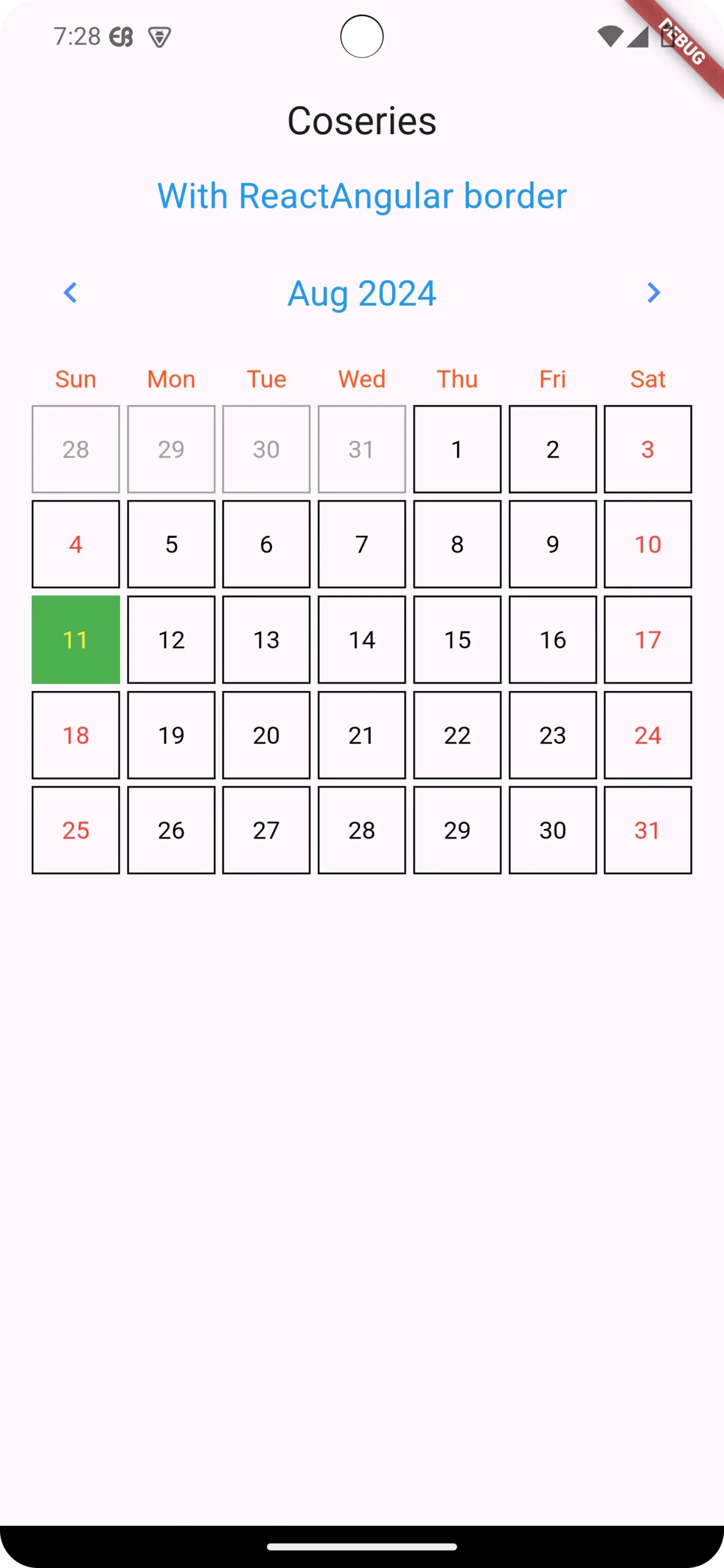
Flutter Calendar Carousel: Create Stunning Calendar UIs with Ease
in Flutter on August 12, 2024by Kawser MiahThe Flutter Calendar Carousel package is a powerful tool for developers looking to integrate a user-friendly and customizable calendar into their Flutter applications. This swipe able calendar widget allows for smooth navigation between months and offers various customization options, making it a perfect fit for apps dealing with scheduling, event tracking, or booking systems.
Table of Contents
Flutter Calendar Carousel
1.1. Brief Overview about Flutter Calendar Carousel package
The Flutter Calendar Carousel package is designed to provide a visually appealing and highly functional calendar widget. Its main strength lies in its flexibility and ease of use, making it an excellent choice for developers aiming to enhance their apps with calendar functionalities. Whether you’re building a fitness app, a booking system, or any application that requires date-based interactions, this package can significantly streamline the development process.
1.2. Context
Imagine building a fitness app where users can track their workout routines by marking specific dates. Or a doctor’s appointment app where patients can easily see available slots and schedule appointments. The Flutter Calendar Carousel package excels in these scenarios, providing a visually appealing and interactive way for users to manage their time and appointments.
2. Key Features
The Flutter Calendar Carousel offers a range of features that elevate your app’s calendar experience:
2.1. Customizable Carousel
Don’t settle for a generic calendar look. This package allows you to tailor elements like day formatting, border styles, and even the first day of the week (Monday or Sunday) to seamlessly integrate with your app’s overall design. You can adjust colors, fonts, and other stylistic elements to ensure the calendar fits perfectly within your app’s theme.
2.2. Event Markers
Highlight important dates with customizable markers. These visual cues can be anything from simple dots to custom icons, making it easy for users to identify events, appointments, or deadlines at a glance. The package provides options to customize the appearance and behavior of these markers, ensuring they convey the necessary information effectively.
2.3. Seamless Navigation
Swiping left or right smoothly transitions between months, allowing users to navigate through time with ease. The navigation experience is intuitive and responsive, ensuring that users can quickly find the dates they are looking for without any hassle.
3. Installation and Setup
3.1. Adding the Dependency:
dependencies:
flutter_calendar_carousel: ^2.0.3
3.2.Importing the Package:
import 'package:flutter_calendar_carousel/flutter_calendar_carousel.dart';4. Basic Usage
Example Code:
DateTime _selectedDate1 = DateTime.now();
final DateTime _targetDateTime1 = DateTime.now();

final CalendarCarousel _calendarCarouselReactAngulerBorder =
CalendarCarousel(
height: 420,
todayBorderColor: Colors.white,
selectedDateTime: _selectedDate1,
targetDateTime: _targetDateTime1,
daysHaveCircularBorder: false,
showOnlyCurrentMonthDate: false,
customGridViewPhysics: const NeverScrollableScrollPhysics(),

onDayPressed: (date, event) {
setState(() => _selectedDate1 = date);
},
selectedDayButtonColor: Colors.green,
selectedDayTextStyle: const TextStyle(color: Colors.yellow),
weekendTextStyle: const TextStyle(color: Colors.red),
thisMonthDayBorderColor: Colors.black,
todayTextStyle: const TextStyle(color: Colors.white),
todayButtonColor: Colors.blue,
prevMonthDayBorderColor: Colors.grey,
nextMonthDayBorderColor: Colors.grey,
);
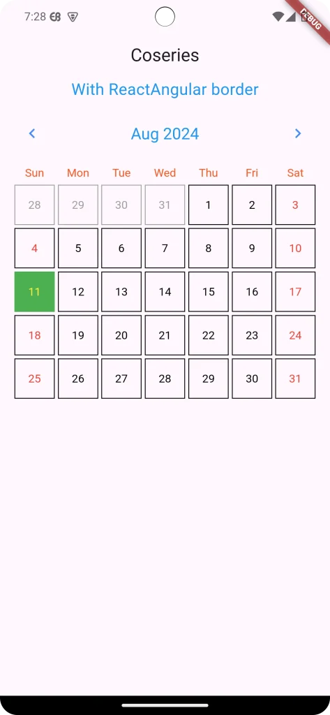
Output:

If you want circular border on day then make true daysHaveCircularBorder property.
daysHaveCircularBorder: true,For Without any border
daysHaveCircularBorder: false,5. Advanced Usage
5.1.Event Markers:
First, You need to create EventList as follows.
final EventList _markedDateMap = EventList(events: {
DateTime(2024, 7, 29): [
Event(
date: DateTime(2024),
title: "Event1",
dot: Container(
margin: const EdgeInsets.symmetric(horizontal: 1.0),
color: Colors.red,
height: 5.0,
width: 5.0,
),
),
Event(
date: DateTime(2024),
title: "Event2",
)
],
DateTime(2024, 7, 12):[
Event(date: DateTime(2024, 7, 13),)
]});
Then you must add the event list in the CalendarCarousel as the markedDatesMap property.
markedDatesMap: _markedDateMap,
markedDateCustomTextStyle: const TextStyle(color: Colors.blue),
Final output with the event for Flutter Calendar Carousel:
6.Final code
main.dart
import 'package:flutter/material.dart';
import 'package:flutter_calendar_carousel/flutter_calendar_carousel.dart'
    show CalendarCarousel;
import 'package:flutter_calendar_carousel/classes/event.dart';
import 'package:flutter_calendar_carousel/classes/event_list.dart';

void main() => runApp(const MyApp());

class MyApp extends StatelessWidget {
  const MyApp({super.key});
  @override
  Widget build(BuildContext context) {
    return MaterialApp(
      title: 'coseries.com',
      theme: ThemeData(
        primarySwatch: Colors.purple,
      ),
      home: const HomeScreen(
        title: 'Coseries',
      ),
    );
  }
}

class HomeScreen extends StatefulWidget {
  final String title;
  const HomeScreen({super.key, required this.title});

  @override
  State<HomeScreen> createState() => _HomeScreenState();
}

class _HomeScreenState extends State<HomeScreen> {
  DateTime _selectedDate = DateTime.now();
  final DateTime _targetDateTime = DateTime.now();


  final EventList<Event> _markedDateMap = EventList<Event>(events: {
    DateTime(2024, 7, 29): [
      Event(
        date: DateTime(2024),
        title: "Event1",
        dot: Container(
          margin: const EdgeInsets.symmetric(horizontal: 1.0),
          color: Colors.red,
          height: 5.0,
          width: 5.0,
        ),
      ),
      Event(
        date: DateTime(2024),
        title: "Event2",
      )
    ],
    DateTime(2024, 7, 12): [
      Event(
        date: DateTime(2024, 7, 13),
      )
    ]
  });
  @override
  Widget build(BuildContext context) {

    final CalendarCarousel _calendarCarouselReactAngulerBorder =
        CalendarCarousel<Event>(
      height: 420,
      todayBorderColor: Colors.white,
      selectedDateTime: _selectedDate,
      targetDateTime: _targetDateTime,
      daysHaveCircularBorder: false,
      showOnlyCurrentMonthDate: false,
      customGridViewPhysics: const NeverScrollableScrollPhysics(),
      onDayPressed: (date, event) {
        setState(() => _selectedDate1 = date);
      },
      selectedDayButtonColor: Colors.green,
      selectedDayTextStyle: const TextStyle(color: Colors.yellow),
      weekendTextStyle: const TextStyle(color: Colors.red),
      thisMonthDayBorderColor: Colors.black,
      todayTextStyle: const TextStyle(color: Colors.white),
      todayButtonColor: Colors.blue,
      prevMonthDayBorderColor: Colors.grey,
      nextMonthDayBorderColor: Colors.grey,
          markedDatesMap: _markedDateMap,
          markedDateCustomTextStyle: const TextStyle(color: Colors.blue),
    );

    return Scaffold(
      appBar: AppBar(
        title: Text(widget.title),
        centerTitle: true,
      ),
      body: SingleChildScrollView(
        child: Column(
          mainAxisAlignment: MainAxisAlignment.start,
          crossAxisAlignment: CrossAxisAlignment.start,
          children: [
            Container(
              child: const Center(
                  child: Text(
                "With ReactAngular border",
                style: TextStyle(fontSize: 20, color: Colors.blue),
              )),
            ),
            Container(
              margin: const EdgeInsets.symmetric(horizontal: 16),
              child: _calendarCarouselReactAngulerBorder,
            ),
          ],
        ),
      ),
    );
  }
}
7. Conclusion
7.1. Summary
The Flutter Calendar Carousel package provides a feature-rich, customizable, and user-friendly solution for integrating calendars into your Flutter apps. Its swipe navigation, event markers, and extensive customization options make it a valuable tool for scheduling, event tracking, and booking applications.
7.2. Final Thoughts
By leveraging the Flutter Calendar Carousel package, you can enhance your app’s calendar experience and simplify time management for your users. Remember to explore the customization options and tailor the calendar to match your app’s design and functionality. With a little effort, you can create a visually appealing and interactive calendar that adds value to your app.
Source code : https://github.com/Kawser-Miah/flutter_calendar_carousel_package
Reference: https://pub.dev/packages/flutter_calendar_carousel
You can read also: Flutter Debugging best practices


